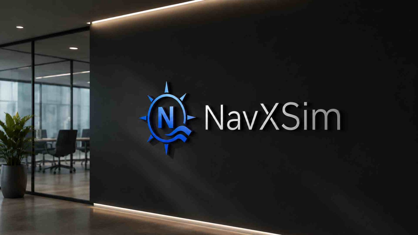
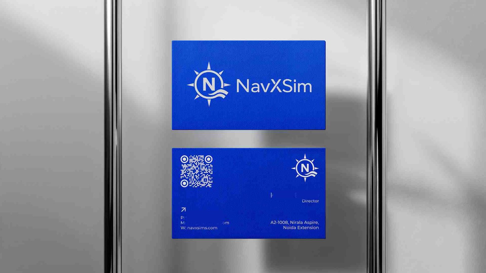
NavXSim is a technology-driven brand focused on navigation, simulation, and advanced digital solutions. The objective was to create a distinctive visual identity that communicates precision, innovation, and technological expertise while maintaining a clean and contemporary appearance.
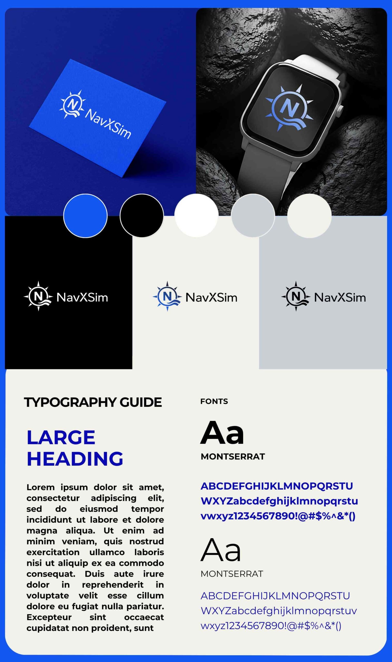
The identity combines a compass-inspired symbol, the letter “N,” and wave elements to represent navigation, direction, connectivity, and movement. A bold blue, black, and neutral color system was developed to give the brand a confident and futuristic presence across both digital and physical applications.
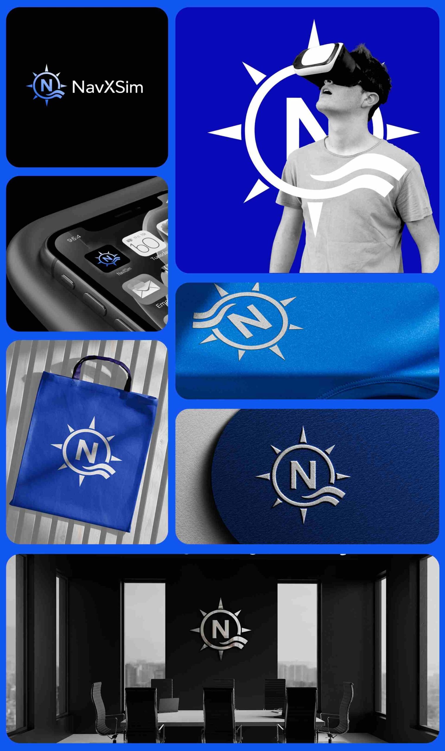
The branding was further developed into a cohesive visual system, including logo variations, color applications, typography, and branded mockups to demonstrate how the identity can adapt across different touchpoints.
Services
Logo Design · Brand Identity · Visual Guidelines
Industry
Technology · Navigation · Simulation
Deliverables
Logo System · Color Palette · Typography · Brand Guidelines · Brand Applications