ForCabs is a modern mobility brand created around the idea of convenient, dependable, and accessible transportation. The objective was to build a distinctive visual identity that feels simple, confident, and instantly recognizable.
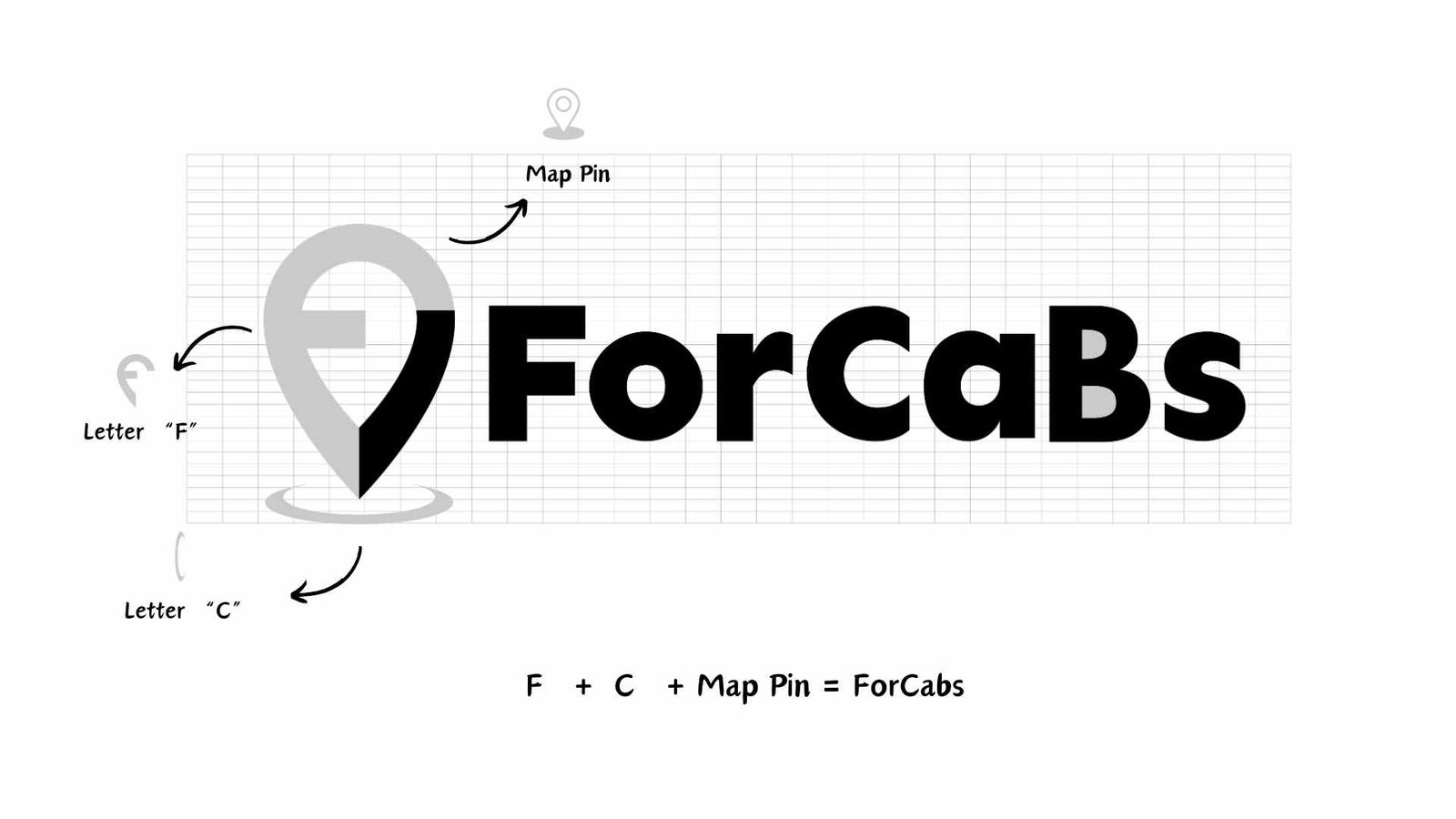
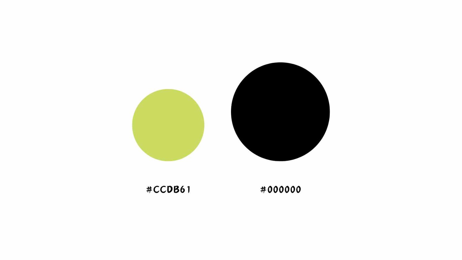
The logo combines the initials “F” and “C” with a map-pin symbol, creating a meaningful mark that connects the brand with movement, location, and connectivity. The identity was then supported by comprehensive brand guidelines to establish a consistent visual language across future brand applications.